VERSION #3 IS UP. Same URL. Comments welcome.
VERSION #2 IS UP. SAME WEB ADDRESS! Post comments please =)
OK, before you guys start ripping me a new one (which is usually what happens when I try to contribute to the community! Remember BaconCore, anybody??) keep 3 things in mind:
1) I can and will change things.
2) I worked very hard on this (a total of around 20 hours of work over 2 days).
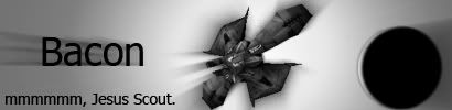
3) The new banner was made from scratch, meaning I am a total badass (who may or may not have used a photoshop tutorial....)
Anyway, a quick recap of why I want to change the portal page:
-This is the face of the game for people just discovering it. The current page, while serviceable as a portal, is pretty boring. Just look at it. It's bland, blue, and dull both visually and while reading it. I would not be attracted to Allegiance from this page. If you go to any other game's website, it does not look like this.
-Where are the references to the backstory of why we are all supposedly fighting? Where is the immersion? Where is the "hook?" Allegiance as a sport is fun for us crusty vets, but for newbies it's intimidating and technical, just like the current portal page. Newbies are attracted to a fun game that they can pwn in, not a complicated e-sport that they quickly realize that they will suck at.
-Where is a place newbies can EASILY read about certain aspects of the game without having to search through the Wiki, tomes of player-written manuals, or the forums? How do newbies QUICKLY and EASILY get a brief introduction to what kinds of weapons are in the game, what the differences are between the factions, and what a team commander does? I'm not asking this because I know the answer -- I want somebody to tell me!
-Why have we done away with the fantastic intro video that greeted us all from our retail discs back in 2000?
With all that in mind I did the following:
-Re-did the banner. I wanted something that really "popped" and screamed "EXCITING!" So, I made one that I think does both.
-Posted a link to the great intro video which loads it right on the page. If there's an HD version of it somewhere, somebody gimme the link.
-Re-wrote the little blurb describing what Allegiance is. I threw out the technical "This is what you do in Allegiance" and made it more like what you'd read on the back of a DVD case.
-Removed the block of descriptive text and replaced it with 5 other (more engaging) blocks of descriptive text, all of which are purely optional and auto-hidden from view when the page loads. A newbie who is curious can read about one or all of the given topics, or simply skip it and go straight to the main website without doing any scrolling (and possibly without expending extra bandwidth -- I'm unsure if the entire page loads when you first access it, or just the unhidden segments. Hopefully the latter!)
-Replaced the text-filled buttons with simple tool-tip enabled text links. This is one change I'm not sure is "better," but it definitely removes a lot of the text that is presented to the viewer right off the bat. If somebody is interested, they can do some digging right on that page by reading the tooltips or expanding the 5 topics, or simply skip all of it and go to the community home, download the game, look at screenshots, etc.
-In general, I tried to make the intro page more than just a portal while keep it "just a portal." It is possibly our one and only chance to hook somebody with the game, so I tried to give them the option of doing a little digging right there without any more page loads. If they continue to dig, they'll eventually go to the community home, create an account, log in, and start playing with the knowledge of WHY they are supposedly fighting, which I think is imperative to immersion.
Anyway, with all of that, here's the link. I'm just using some crappy free web host, so hopefully it works OK. Loads for me fine.
http://tehbacon.host56.com/Allegiance/Baco...leg%20Page.html
Epic New Front Page! UPDATED 12/21 (**NOW PRETTY**)

Both of those are things I am unhappy with. Any suggestions? I want to make it obvious that you click on the buttons, but saying "LCIK TEH BUTTNS" is pretty lame.Raveen wrote:QUOTE (Raveen @ Dec 14 2009, 01:50 AM) I like it. I'd draw a wee bit more attention to the forum/download etc. links and saying click the buttons seems a bit clunky.
All in all though, a very good effort, it needs fine tuning, not rebuilding.
As for drawing attention to the download link/forum button, I'm also open to suggestions. Maybe making a graphic instead of having text links?
edit:
Also I think I need to put actual pictures of the ships in the "Ships" section. I don't want people to think that those little icons are what you're flying
Last edited by Bacon_00 on Mon Dec 14, 2009 9:58 am, edited 1 time in total.
"Leave Bacon alone. When he's unsure of what sector he's in somehow it works out better." -Lee
looks very nice 
u know how some games are free to download but later u have to pay to play?, i was wondering if we need to underline that it is in fact, completely free... in that other than voluntary donations for server upkeep, everything is completely free.
u know how some games are free to download but later u have to pay to play?, i was wondering if we need to underline that it is in fact, completely free... in that other than voluntary donations for server upkeep, everything is completely free.


A Spathi's Axiom for Survival: "The only brave Spathi is a dead Spathi. RUN YOU FOOLS!"
Yeah that info is in the tooltip on the "downloads" link... but it needs to be more obvious. Unsure how to fix those links to be both informative but also not clunky.fwiffo wrote:QUOTE (fwiffo @ Dec 14 2009, 02:05 AM) looks very nice
u know how some games are free to download but later u have to pay to play?, i was wondering if we need to underline that it is in fact, completely free... in that other than voluntary donations for server upkeep, everything is completely free.
"Leave Bacon alone. When he's unsure of what sector he's in somehow it works out better." -Lee
Bacon wrote:QUOTE (Bacon @ Dec 14 2009, 09:52 AM) Both of those are things I am unhappy with. Any suggestions? I want to make it obvious that you click on the buttons, but saying "LCIK TEH BUTTNS" is pretty lame.
Make it something along the lines of a Tab page?
Where you can select only one at a time? And there's a Box around the text when a certain button is selected.
A totally lame mockup of the sort of thing I mean with crap colours is here. And you'd probably highlight the selected button in some fashion.....
I quite like it!
Good work bacon....
Last edited by notjarvis on Mon Dec 14, 2009 10:20 am, edited 1 time in total.

Yeah I tried doing that, but my javascript and CSS skills are very, very limited. I had to copy the code from a tutorial just to do the hide/show text stuff. If somebody else could make it so you can only see 1 at a time, that'd be fantastic, cause I can't do it.. Using the hide/unhide functions I have on there now won't work to hide "everything else" when one link is active. It just starts getting super buggy.notjarvis wrote:QUOTE (notjarvis @ Dec 14 2009, 02:19 AM) Make it something along the lines of a Tab page?
Where you can select only one at a time? And there's a Box around the text when a certain button is selected.
A totally lame mockup of the sort of thing I mean with crap colours is here. And you'd probably highlight the selected button in some fashion.....
I quite like it!
Good work bacon....
"Leave Bacon alone. When he's unsure of what sector he's in somehow it works out better." -Lee
Is anyone here good with adobe flash?
Not jarvis is right with the tabs idea
I suggest putting in screenshots of some of the ships on the ships section rather than their icon, the icon makes it kinda look like a text based game before you go to the screenshots
Not jarvis is right with the tabs idea
I suggest putting in screenshots of some of the ships on the ships section rather than their icon, the icon makes it kinda look like a text based game before you go to the screenshots
Last edited by madpeople on Mon Dec 14, 2009 10:51 am, edited 1 time in total.


